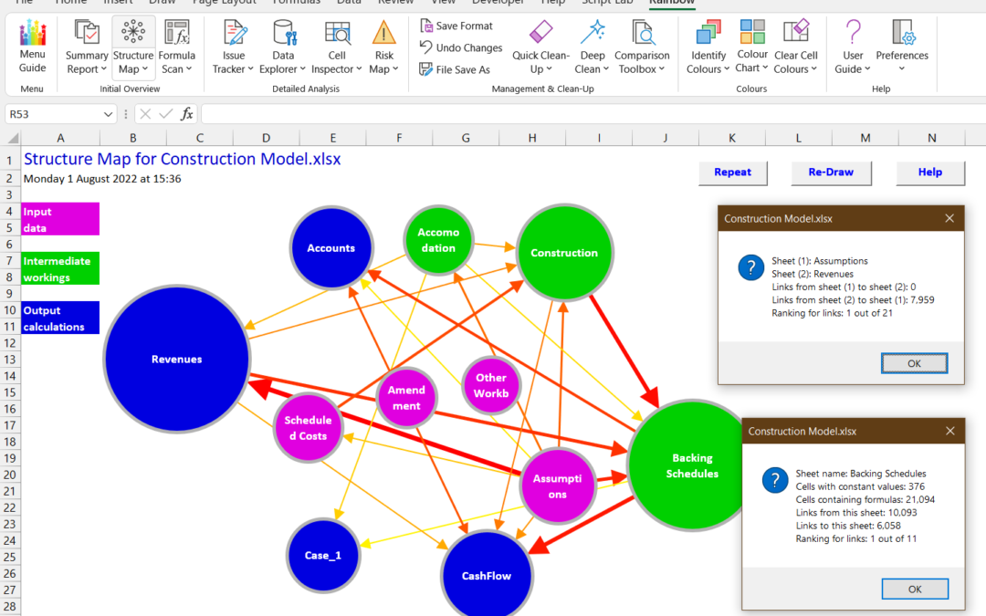
When someone sends you a spreadsheet to look at, do you ever wish there was an easy way to see what’s going on? Well, now there is, with the new Structure Map function in Rainbow 12.5. As you can see in the composite screenshot above, this gives you a simple and clear diagram of all the sheets and how they are linked.
Sheets with mainly input data are shown as purple, intermediate workings as green, and output calculations as blue, and you can also see the size of each sheet. The direction and importance of the links between them are shown by the direction of the arrows and their colour and size. And if you’re thinking the arrows are pointing the wrong way – check out the Rainbow User Guide (from row 283) for a full explanation!
We think this new function perfectly complements the Summary Report, which gives you lots of data about a workbook but needs the Structure Map to explain how it all fits together. So we’ve placed the Structure Map (and related functions) right after the Summary Report, in the Initial Overview group. And even with the Structure Map you can see the underlying data, as shown in the composite screenshot above – just click on any circle or arrow for full details. Why not download Rainbow and try it for yourself?

